How to Create the Perfect Logo? – Interview with Professional Graphic Designer Dave Scholze

Rules can be broken as long as it serves a purpose. If a logo communicates what you want, go for it. There might even be some edge-cases where “crazy” is absolutely necessary, as long as it generates the reaction you are going for. Everything you do has to have a reason in order to create something beautiful that still works – states Dave Scholze, a professional designer and creator of the “Masterclass. Business & Art” logo.

Dagmara Nawratek: How to create an eye-catching logo that will be remembered and not forgotten seconds after seeing it?
Dave Scholze: An interesting question indeed. There are several approaches to this, depending on the use-case. Using a known symbol will be especially interesting if you want to capture a certain audience. Creating something new however may be interesting for the more adventurous. From there it is all about shapes, colors, fonts and the emotional reaction it ought to provoke.
Is it worth focusing on simplicity? Is a simple logo easier to recognize and remember?
In general, I would say so. Making something too complex will be harder to remember in general. It is all about what you want the viewer to experience. In some cases, a complex logo might be perfect to create a mystery or to intrigue people. I know, it is not as clear an answer as it could be. For the most part however, especially for corporate design, simplicity is king.
Are there any rigid, ironclad rules when creating a logo?
I would like to say yes, but as for all kinds of art: it depends. You could start with some of the basic rules like simplicity, the correct use of color, fonts and overall intention. While intention, as of all kinds of design, is non-negotiable, the rest of the rules can be broken as long as it serves a purpose. Make sure to learn the basic rules first to actually understand when it is necessary to break them. Additionally, if the logo is for a special customer, make sure to integrate various brand-related design-patterns if available.
Could you give us some key tips on how to do it right?
Intent: Always be aware of what you want to achieve and communicate. If there is anything that does not have a purpose: Remove it unless it improves the art itself. Color matters: Which to use as an emotional anchor and color-schemes in general. Symbolism: Make use of what people know already. Compatibility: Always keep in mind that some logos might be placed on multi-colored backgrounds.
Is it worth going outside the usual patterns in specific cases?
Of course. Grabbing attention in our modern world is hard. Just using what we know already, while being easy to grasp, sometimes just is not enough. The most important thing to remember, however, is that there is a difference between a complex, bold design and an unreadable mess. For example: A bright, desaturated yellow on a white background is just plain unreadable. A complex tribal design with lots of detail with a flashy, but well distinguishable color? If it communicates what you want, go for it. There might even be some edge-cases where “crazy” is absolutely necessary, as long as it generates the reaction you are going for.
How to express the values of a given brand precisely and clearly?
The easiest answer is: Ask them! What is their history? What is their goal? What makes them special? Go from there and incorporate everything you have learned the best you can. If they have something in particular in mind, deliver that but some alternatives as well. Make suggestions that they never could have imagined.
How to use the brand book when creating a logo?
Here simply do some research whether they already have a design philosophy or even a corporate design or corporate identity for you to make use of. If they do not have, check their website. What colors do they primarily use? Is there any kind of symbolism or an object or living creature they align themselves with?
What else should you remember if you want to use the logo not only in large-format prints, but also on leaflets, websites or in catalogues?
When creating a logo you must use vector graphics. That way the logo is easily scalable and will not lose any detail doing so. Other than that, ask where the logo will be used. Maybe it will work perfectly on dark surfaces, but not on bright ones. In that case, do you change the logo to work on both or do you create various color-variants to make it work?
In what aspects and stages of creating a logo can the support of a professional graphic designer be beneficial?
I can list a few differences between the real designers I have experienced and people without the requisite knowledge in this area, who usually choose what they think looks best. They use things they personally prefer, especially shapes and colors. What they are lacking is an understanding of symbolism, color-theory and intent. Just because something looks nice does not mean it is appropriate for a logo. Everything you do has to have a reason in order to create something beautiful that still works. Getting there, however, requires a lot of effort and when someone starts creating logos, they do not yet know the things they do not know.
How does the situation look like for specific popular brands using the services of a staff of skilled design professionals? And what kind of considerations were taken into account when creating their logos? Could you discuss this with examples?
It is very important to emphasize that there are multiple kinds of logos. Some are but a single symbol, some work with a word or phrase using some complex typography while others may incorporate both. Depending on the kind of logo required, different considerations have to be made. Just think of Nike: the checkmark does not represent shoes or fashion, yet managed to create a unique image for the company. Fila on the other hand created its logo in text-form by making use of a custom font to make it easily recognizable.
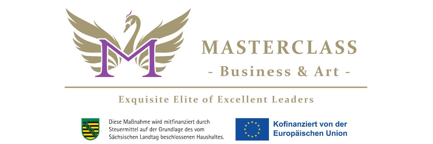
And what considerations did you take into account when creating the logo for the magazine “Masterclass. Business & Art”?
As for the Masterclass logo, it is a mix of text and a more complex graphic making use of symbolism and shapes. I used symbolism and color with a standard-type font. The swan is a mix of design and art: What looks great? What shapes represent grace and luxury? How much simplification is needed to keep it recognizable? I guess I could go on and on … so as a quick summary: There are different types of logos, each requiring their own considerations.
Is there any way to make sure of the soundness of an idea or project? What could you recommend?
I highly recommend gathering feedback. Even if you have taken everything into consideration, people might react differently anyway.
Interviewed by: Dagmara Nawratek, www.masterclassmagazine.com, pr@masterclassmagazine.com
Answered by: Dave Scholze, www.davethefreak.com
Picture by www.davethefreak.com